Getting AI to build web lessons that look like a polished slide deck
Write the script first, then a storyboard. Name a style and list what to avoid. Includes a ready-to-use prompt, a sample deck and a slide version.
Slide version: the same content as a 16-page deck. See the result on the left, copy the prompt on the right with one click. Open the slide version →
A few days ago I had AI build a 26-page slide-style lesson as a web page. You turn pages with the scroll wheel or arrow keys, pages that explain how something works have animations, and one page has a slider you can drag to see how the numbers change. I was happy with the features and the finish, but the look was ordinary: clean, nothing broken, nothing memorable either.
This post writes down the whole process, including the “style” step I added afterwards. You don’t need to code. If you can chat with ChatGPT or Claude, you can follow along.
I turned the example in this post into a Neo-Brutalist sample deck. Have a look first: sample deck (switch between English, Japanese and Chinese at the top right).
The short version: hand this to your agent
If you don’t have time to read it all, press “Copy” at the top right of the box below and paste it into your AI (Claude or ChatGPT both work). Replace what’s in braces with your own details and it will follow the process from this post step by step.
Please make me a web lesson that looks like a polished slide deck, following the process below.

Topic: {your topic, e.g. "How the Tesla Roadster flies, and how it hangs upside down"}
Readers: {who will read it, what they already know, what they should be able to do afterwards}
Style: {e.g. "Neo-Brutalist" or "an Apple keynote"; if I haven't decided, suggest 2–3 for me to choose from}

Process (stop after each step and wait for my OK before going on):
1. Write only the script first, in Markdown, one point per section. Give sources for facts and numbers, and keep what has been confirmed separate from what has only been claimed.
2. Turn the script into a storyboard table: page | the page's point in one sentence | picture | what the animation explains ("none" if there isn't one). One point per page.
3. After I approve the storyboard, build the pages:
   - A single HTML file with no external resources; it must open offline
   - 16:9, centred and scaled; scroll wheel, arrow keys and space turn pages, one page per scroll; chapter name and page number at the bottom
   - Pages that explain how something works get a canvas animation that answers one "why": 3–6 seconds, plays once and stops, with a replay button. Where numbers are related, add one draggable slider
   - State the style's reference, exact colour codes and fonts; at most 3 accent colours, and each colour keeps one meaning throughout
   - Avoid: a cover with a big centred headline and two buttons, three equal cards side by side, blue-purple gradients, glowing orbs, particles, blur-in effects, elements flying in one by one, emoji as icons, boxes inside boxes
   - Body text at least 18px, captions at least 13px
4. When done, screenshot every page (three shots for animated pages: start, middle, end), check for overlapping or overflowing text and text that's too small, and fix it before handing it over. If you can't run code or take screenshots, give me the complete HTML file and remind me to check each page myself.
The rest of this post explains the whole process and why each step matters.
Why a web page instead of PowerPoint
Almost anything PowerPoint can do, a web page can do too. A web page adds three things:
- Animations can explain how things work. Why can a car stop upside down at the top of a ramp without falling? A 5-second animation explains it better than three lines of text.
- Readers can try it themselves. Put in a slider, drag the thrust, and you see the exact moment the car lifts off. People remember what they’ve played with.
- One file opens anywhere. Make it a single .html file and whoever gets it just double-clicks to open it in a browser, on a computer or a phone, with nothing to install.
The cost is that editing is less convenient than PowerPoint: you can’t drag text boxes around. So do a bit more preparation up front and you won’t have to keep fixing things later.
What you need
- An AI that can write code. Claude’s Artifacts and ChatGPT’s Canvas both preview the page right next to the chat, which is the easiest way to start.
- A browser. If the AI has no preview, copy all the code it gives you, save it as “lesson.html”, and double-click to open it.
- A topic you can explain well. This post uses how Tesla’s new Roadster “flies” and how it “hangs upside down on a wall”.
The three things that matter most
1. Write the script first, build pages later
If you start with “make me a lesson on how the Tesla Roadster works”, the AI thinks about content and layout at the same time, and every page ends up stuffed with text. It looks like a Word document with a new background.
The right order: have the AI write a script (text only), read it and fix it yourself; then split the script into a storyboard where each page has one point and one picture; only then have it build the pages. With content and layout kept apart, changing one sentence won’t break the layout of a page.
2. Animations explain how things work. They are not decoration
Every animation should answer one “why”. Why does blowing gas lift the car? Why doesn’t it fall when it’s upside down? Those are good animations. Titles flying in and cards popping up one by one are not. They only distract.
Keep animations to 3 to 6 seconds. Play once when the page opens, then stop, with a replay button next to it. Where there’s a relationship between numbers (angle, distance, speed), make it a slider and let the reader drag it.
3. Name the style, and say what you don’t want
This is where my first attempt fell short. Without a named style, the AI gives you “average taste”: white background, blue buttons, rounded cards, the look you’ve seen everywhere.
For something with character, put four things in the prompt:
- A reference: for example “an Apple keynote” or “a Neo-Brutalist indie product site”
- Exact colour codes: background, body text, accent colours
- Fonts: what to use for headings and for body text
- A list of what to avoid: blue-purple gradients, three equal cards side by side, emoji used as icons, and so on
Key point: The last one is the easiest to forget and the most effective. The AI’s average taste is made of exactly these common elements. Rule them out one by one and what remains is the style you asked for.
Step by step: “How the Tesla Roadster flies, and how it hangs upside down on a wall”
On October 15, Tesla unveiled its new Roadster and showed two things on stage: the car jumping and rolling in the air on gas jets, and the car driving up a curved ramp and stopping upside down at the top. Each comes down to one piece of school physics, which makes them perfect for explainer animations.
Step 1: Write the script
Tell the AI:
I want to make a web lesson of about 7 pages called "How the Tesla Roadster flies, and how it hangs upside down on a wall", for adults who never studied physics.
Only write the script for now, in Markdown, one point per section. Don't build any pages yet.
Keep a clear line between what was actually shown at the event and numbers that Tesla has only announced.
Read the script yourself when you get it. Trending topics need extra checking: go by official announcements and reliable reporting, because what the AI remembers may be out of date or even made up. In this example, the “flying” was really a few seconds of jumping and rolling, not sustained flight, and the 4,700 kg of suction is Tesla’s own figure, which some reviewers think is too high. Get these right in the script. Fixing them after they’re animated is a pain.
Step 2: Turn it into a storyboard
Turn the script into a storyboard table, one row per page: page | the page's point in one sentence | picture | what the animation explains ("none" if there isn't one)For this example it comes out roughly like this:
| Page | Point in one sentence | Picture | Animation |
|---|---|---|---|
| 1 | How does a car fly, and hang upside down? | Cover: the car in side view | None |
| 2 | Blow gas backward, the car goes forward | Rear nozzles, gas flow, force arrows on the car | Gas shoots backward and the car speeds up (action and reaction) |
| 3 | Once thrust beats the car’s weight, it lifts off | Nozzles pointing down, thrust and gravity arrows | Drag a slider to change thrust; the car lifts off the moment thrust exceeds its weight |
| 4 | It only flies a few seconds because the tank runs out | The tank and how much air is left | The air level drops, the thrust disappears, the car lands |
| 5 | Fans pump the air from under the car, and the atmosphere presses it onto the road | Cross-section under the car: skirts, fans, air | The pressure arrows under the car shrink while the air pressure on the roof stays the same |
| 6 | If pressure gap × floor area beats the weight, it can hang upside down | The car upside down, pressure and gravity arrows | Drag a slider to change the pressure under the car and see whether it falls or sticks at the top |
| 7 | Summary: one pushes out, the other presses in | Two small diagrams side by side | None |
Check: When you look at this table, ask yourself only one thing: does each page have exactly one point? If a page tries to say two things, split it into two pages.
Step 3: Pick a style
If you’re not sure which style to use, browse the design styles page on VibeHub (vibe-hub.org). It collects 24 styles, each with a description and examples. Here are two:
- Apple style: black or light grey background, one sentence and one big picture per page, lots of space. Good for explaining how things work and for concepts.
- Neo-Brutalist: off-white background, thick black outlines, bright blocks of colour, hard shadows. Good when you want something eye-catching and a bit playful.
Step 4: Generate it with the full prompt
Once the storyboard is settled, use the template below. Its four parts are inputs, style direction, structure and build requirements. This way of splitting a prompt comes from the best-performing animation prompts on Prompt Motion (prompt-motion.com). Replace what’s in braces with your own content. Anything you leave out, the AI fills with defaults.
<inputs>
Topic: {the lesson's topic}
Readers: {who will read it, what they already know, what they should be able to do afterwards}
Script: {paste the checked script and storyboard}
Pages: {about N pages}
</inputs>

<direction>
Reference: {e.g. "an Apple keynote"}
Canvas: background {colour code}; body text {colour code}; at most 2 accent colours {colour codes}, each with one fixed meaning: {colour = meaning}
Fonts: system fonts for text, a monospace font for numbers and code
Layout: one point per page; the headline states the conclusion in one sentence; white space is there to focus attention
Avoid:
- a cover with a big centred headline and two buttons
- three cards of equal width side by side
- blue-purple gradients, glowing orbs, particles, blur-in effects, 3D flips
- every block flying in one after another
- emoji used as icons
- boxes inside boxes, a divider under every paragraph, coloured bars down the left side
- anything that looks like a template
</direction>

<structure>
Follow the storyboard, one section per page.
- Pages that explain how something works get an animation that answers one "why": 3–6 seconds, plays once and stops, can be replayed
- Where numbers are related, add one draggable slider
</structure>

<build>
- A single HTML file with no external resources; it must open offline
- 16:9, centred and scaled; scroll wheel, arrow keys and space turn pages, and one scroll must not skip several pages
- Show the chapter name and page number at the bottom
- Put colours, fonts and font sizes in variables and use only those variables throughout
- Draw animations on a canvas, computing every frame from the time
- Body text at least 18px, captions at least 13px
</build>
For the two styles, you can swap these in for the <direction> part above:
Apple style
Reference: Apple keynotes and apple.com product pages
Canvas: #000000 or #F5F5F7; body text #1D1D1F (light background) / #F5F5F7 (dark background); only 1 accent colour
Fonts: SF Pro; headlines 64–96px, weight 600, slightly tight letter spacing; body text 20–24px
Layout: one sentence and one big picture per page; lots of white space
Animation: easing that starts slow and stops quickly; only one thing moves at a time; no bouncing
Avoid: as above; frosted glass only for overlays, gradients only on the one key word
Neo-Brutalist
Reference: Neo-Brutalist indie product sites and event pages
Canvas: off-white like #FFF8E7; thick 3px black outlines; hard solid black shadows with no blur (6px offset)
Accent colours: 2–3 bright blocks of colour (e.g. #FFD23F, #3BCEAC, #EE4266), each with one fixed meaning
Fonts: extra-bold headlines (weight 800+), regular weight for body text so it stays readable
Layout: colour-block cards, sticker-style labels, slightly tilted highlights; the information hierarchy must stay clear
Animation: crisp moves and press-down effects; no soft fades
Avoid: as above; decoration must never outshine the content; no more than 3 loud colours overall
What it looks like
Following the prompt above, I built it with the Neo-Brutalist <direction>: open the sample deck. Off-white background, thick black outlines, hard shadows, sticker-style labels.
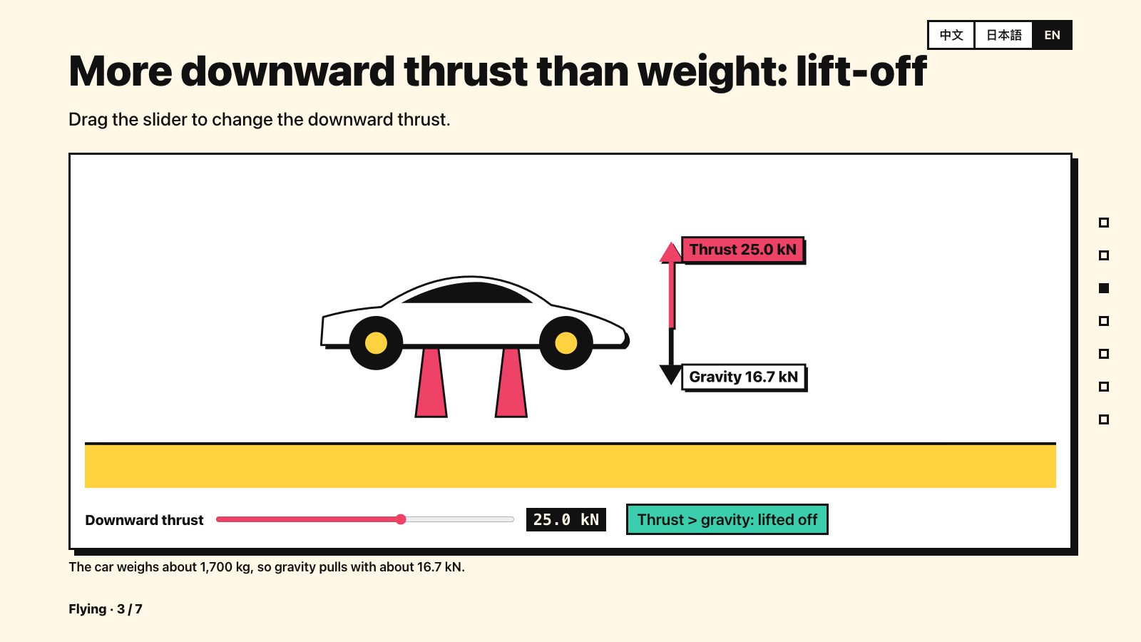
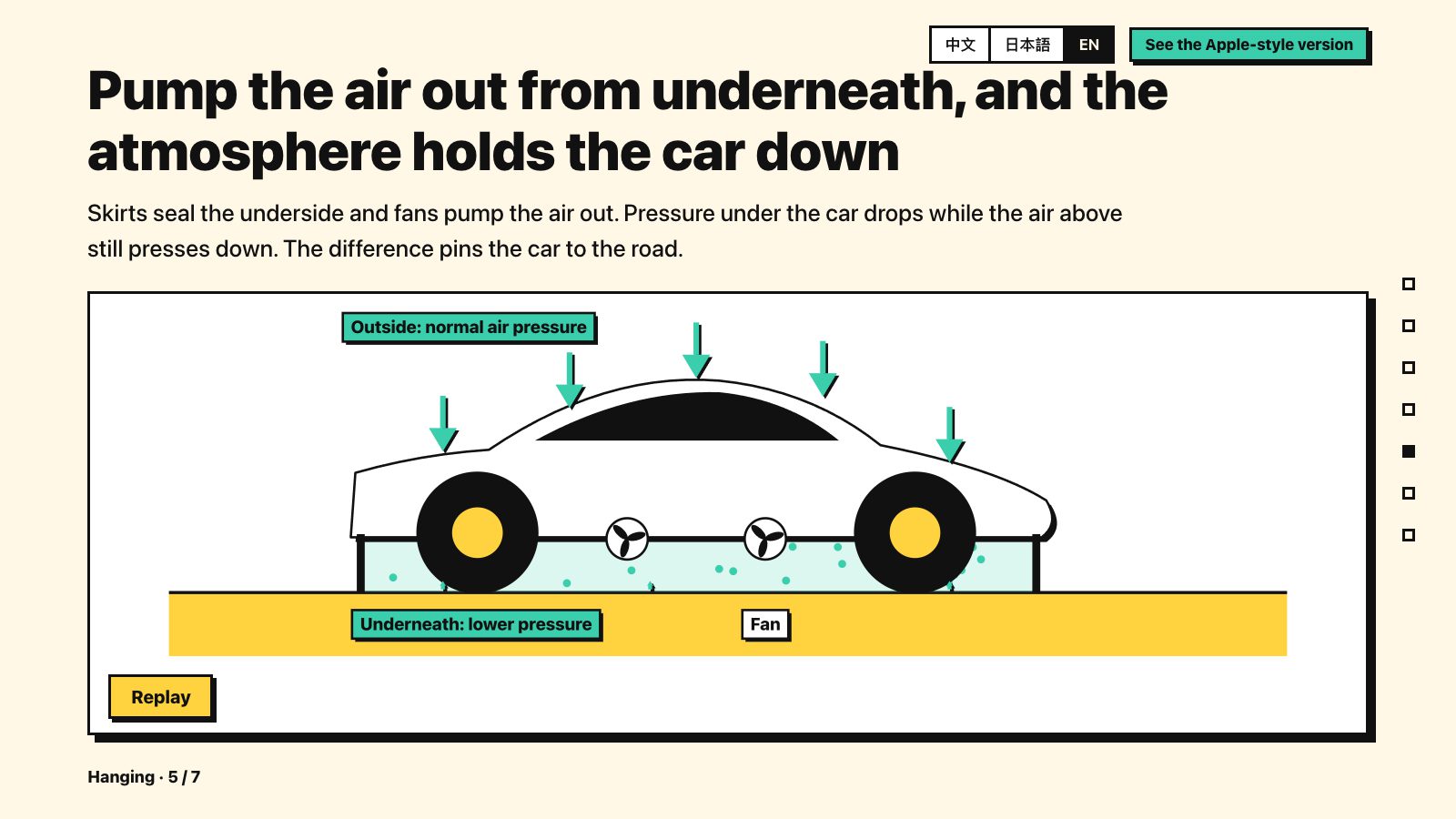
Each colour keeps one meaning throughout: thrust is always red, air pressure always teal, gravity always black. Pages 3 and 6 have sliders, and the animations on pages 2, 4 and 5 can be replayed. They look best on a computer; on a phone, turn it sideways.
Step 5: Check every page
Always look at every page the AI built yourself. Don’t stop at the AI saying “done”. Common problems: text overlapping a picture, labels sitting on top of lines, an animation’s last frame not stopping in the right place, text too small to read. When a page has a problem, paste a screenshot of it straight into the chat and say which page, which element, and what it should look like, for example “On page 5, the ‘Outside: normal air pressure’ label covers the car body. Move it above the roof.” Fix one thing at a time and look again after each fix. Ask for several fixes at once and one fix often breaks something else.
If you use an agent that can run code itself (such as Claude Code), add one line at the end of the prompt: “When you’re done, screenshot every page, and take three shots of each animated page (start, middle, end). Check for overlapping or overflowing text yourself and fix it before handing it to me.” It checks its own work first, and you’ll find far fewer problems.
Common pitfalls
- Give each colour one fixed meaning. In this example the thrust arrow is always red, gravity is always black and air pressure is always teal. Keep it that way all the way through, and readers know what a colour means at a glance.
- One scroll skips several pages. A single swipe on a laptop trackpad fires many page turns. Writing “one scroll must not skip several pages” in the prompt prevents it.
- Text keeps getting smaller. To fit everything on a page, the AI quietly shrinks the font. So state a minimum font size.
- Animations that loop forever. Constant looping is distracting. Write “plays once and stops, can be replayed”.
- Too many pages to finish in one go. With many pages, the AI may not manage to write everything in one reply (this is my own experience; the limit differs between tools). Build the first few pages to settle the style, then have it add one chapter at a time in the same style. When adding, ask it to “output only the new pages” and paste them into the file yourself. Don’t let it rewrite the colour, font and page-turning code each time, or things start to drift out of sync.
- A wrong explanation means fixing everything. If one sentence in the script is wrong, the pages, the animations and your own notes all have to change. That’s why checking at step 1 saves the most work.
A 10-point check before you share it
- Does each page have only one point? Can the headline say it in one sentence?
- Does each colour mean the same thing throughout?
- Any template look, like a big centred headline, blue-purple gradients or three equal cards?
- Does each animation explain how something works? Can it be replayed? Does the last frame stop cleanly?
- Is the body text big enough?
- Does it open offline?
- Does one scroll skip several pages?
- Have you looked at every page yourself?
- Have you checked the facts in the script?
- Did you name the style yourself, or is it the AI’s average taste?
Finally
The slowest part of this process is the first two steps: writing the script and splitting it into a storyboard. Generating the pages is actually quick. If you just want to try it, take the prompt template above, pick a topic you know well, and build 5 pages to see how it turns out.
Sources used in this post:
- VibeHub design styles: vibe-hub.org
- Prompt Motion animation prompt collection: prompt-motion.com
- VibeHub “Avoiding the AI look”: vibe-hub.org/anti-ai-flavor